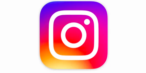
All successful companies have a good logo. And logos often evolve along with the changing and development of the company. Recently, Instagram has changed its logo.
The reasoning of changing its logo was said to accommodate the evolving of the Instagram community over the past five years, from a place to share filtered photos to so much more —a global community of interests sharing more than 80 million photos every day.
The previous logo, a retro-looking camera, and one of the most recognizable tech logos out there, has been replaced by a background swirl of sunset colors of orange, yellow, pink, and purple and a white outline of a camera. However, many people on the Internet with strong opinions are not happy with the change.

I find the new logo is a good one.
One of the traits of a good logo is simplicity. In studying the evolution of logos of successful companies, you will find they are always changing from a complicated design to a simpler design. Apple’s logo, from initially having a man lying under an apple tree to the current design is a good example. Instagram’s new logo, regardless of what idea is behind it, from a more complicate to a simpler one is a good move. The new logo has a wholesome form. Wholesome form provides wholesome energy.
However, like all design, they have room for improvement. In following Feng Shui concepts and the Yin-Yang Theory (natural principle), good design should also include the elements of stability, a focus point, momentum, embed right information, and be in alignment with Yin-Yang principles.
In applying these concepts and principles, the Instagram logo’s form is good. However, the color placement is not in align with the Yin-Yang Theory. In principle, the Yin color should be in the yin position, which is the bottom left-side, and the Yang color should be in the yang position, the upper right-side. Following this placement, the resonance of position and color energy create power.
Currently, the color placement for Instagram’s logo is just the opposite. My suggestion of simple adjustments can be made without changing the overall color design. We can just flip the colors from up to down and left to right as in image 3.
This simple and small adjustment will change the good logo into a much better logo, as it will now have the power of resonance. And will change it from a sunset color to a sunrise color.


Yes, Dr. Hsu. Again, your design is much better. It turns a dull sunset into a much lifting sunrise design.
They should pay you handsomely for the consulting fee. 🙂
Thanks