Master Hsu explains what is Yin and Yang of a cottage and two-storey house:
Master Hsu about bedroom:
Dr Hsu says how to place a bed:
How to locate garage and watercloser on a land:


Master Hsu explains what is Yin and Yang of a cottage and two-storey house:
Master Hsu about bedroom:
Dr Hsu says how to place a bed:
How to locate garage and watercloser on a land:

The cubicle has become a standard feature of modern office design in the corporate workplace. Yet most people do not feel comfortable working in a “cube world.” It creates lots of stress, anxiety, and agitation, ultimately resulting in a negative impact on both creativity and productivity.
Continue reading

Now let us look at the Four Features on a smaller scale – a manager’s office as shown in the image below.
The solid wall behind the manager’s desk and chair is the Mountain feature.
Continue reading

Herman Miller invented the cubicle in 1956, with the idea of creating more privacy and helping to reduce distraction and increase concentration. Since then, the cubicle has become a standard feature of modern office design in the American workplace. Offices designed using this modular unit, often called mouse mazes or cube farms, have become the symbol of human conditioning, and of the reduction of individuality to uniformity and blandness.
One thing we know is that most people do not want to work in a “cube world”. A common report from those working in cubicles is that they find themselves frequently checking the time, anxious for their workday to end so they can get out of the space. After all, a cubicle design is similar to a prison cell. Staring at a partition wall in such close proximity to one’s field of vision, throughout the long work day, replaces feelings of openness and comfort with a sense of being trapped. This feeling, and the resulting impact on creativity, can lead to anxiety and agitation, and even make you feel that you might be going mad. How much of the work-related stress and low productivity of corporate America is due to this working environment? Is this one of the reasons Americans seem to need to work longer hours in the office to finish their work?
Corporations at times try to save money by resisting change that benefit employees. The irony is, such changes in the long term actually benefit the corporation, as they can increase employee productivity, reduce stress levels, and increase overall morale. But often enough, even if a company wants to move away from the cubicle work space; it is hard for most designers to know what to change to.
There have been few attempts to liberate workers from these constricting cell since the cubicle was invented. Most changes have been superficial updates that meet technological and aesthetic advances. Over a decade ago, Knoll took on the challenge of reinventing this modular office unit, and hired a well-known architectural firm to take on the task. However, after two years and millions of dollars spent on research, development, and engineering, they only managed to create a more expensive design that did little to resolve the core issue.
The fundamental reason for this impasse is that industrial designers have not been able to identify the real issue behind the cubicle problem. When you do not feel good in the box, you cannot argue with the feeling. Although the cause may not be clear, the feeling itself is real and valid.
Naturally, when architects, interior designers, and furniture designers make any attempt to “improve” the design, they tend to understand and approach it from a purely physical point of view. As I have often commented, the blind spot for designers throughout history has been that they only see a building or object as a physical body, but not as an energy body – nor as an information carrier. There is much to learn from the wisdom of the traditional Form School feng shui in which all objects and manifestations are seen on all three levels: as a physical body, an energy body, and as an information carrier. Designing with this in mind will naturally create functional, economical and beautiful designs.
God created the human body with a strong spine at the back to hold up the entire body, and with openings in front, such as our eyes, nose, mouth, and ears. Therefore, to live in resonance with our physical body, our living environment should follow this same pattern. In our daily lives, we always feel better when we position ourselves with some protection behind our back with a nice open space in front of us.
Throughout the history of world, people have followed their instincts and built their houses with the backs against a mountain, hill or more protective objects and the front doors facing bodies of water such as rivers, lakes, oceans or facing a nice field or other open space. This is also how we should build our work spaces. The innate flaw of the cubicle office is that it violates this feng shui design principle which is based on natural laws.
In the terminology of Form School feng shui, we need to have Water (for expansion) in front andMountain (for support) at back. Why is this more ideal? In simple language, when we are protected from behind, (for example with a wall closely behind us), we feel more secure, and when we feel more secure, we are more relaxed. When our bodies and minds are more relaxed, the energy in our body flows better, and contributes to a higher spirit, happier feeling and more productivity in our work. Furthermore, having a nice open space in front of us allows an extension of view and vision. This not only helps release our stress, it also frees and expands our thoughts, enhancing creativity. (This is why people nowadays need to have more windows as life becomes more stressful.)
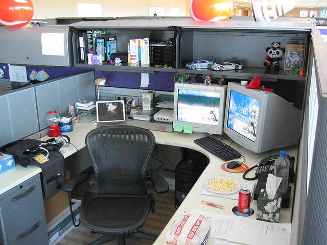
The cubicle design turns this whole principle upside-down. The computer is placed on the working counter against the partition wall (facing a mountain); co-workers pass or approach from behind, causing one to feel vulnerable.
Regardless whether one is aware this impact or not, it builds internal invisible stress. To help mitigate the problem, and in an attempt to bring life to an unexciting space, people who work in cubicles put photos, plants and even mini-fountains in their work spaces. Some workers place small mirrors in front so that they can see reflections from behind without turning. All these design maneuvers may help to some extent, but they do not fundamentally fix the problem. As long as there is no Mountain behind the chair, the insecure feeling remains.
Most bosses would not feel comfortable working in cubicles; in fact, they have the luxury of well-protected private offices. It’s hard not to wonder why bosses would put their employees into spaces that they themselves would not feel comfortable in. Without increasing the space, it is still possible to create a working environment making people feel much more comfortable.
Some office designs do have cubicle partitions that fully protect the worker, with the opening to the side, so that people pass or approach that side. Many people who work in cubicles do this intuitively, when they have the space to do so, by orienting their computer or other work activities toward a side wall rather than toward the back wall. Physically, this is not as comfortable, but emotionally it will be less stressful. This is a definite improvement. If this cannot be done, it may possible to put some large plant at one’s back, as a buffer between one’s back and the world outside the cubicle.
Imaging how much better it will be, when architects, interior designers, furniture designers — and all designers! — understand the traditional Form School feng shui.