Analyzing the 2024 U.S. presidential candidate logos from the perspective of Feng Shui’s Form School, both logos appear strong, but Kamala Harris’s logo has a slight advantage.
In a recent webinar about Logo Design, we discussed the logos of Donald Trump and Kamala Harris, and their chances in the 2024 election. Based on the symbolism of each candidate’s logo, Harris has a marginally higher chance of winning, and here’s why.
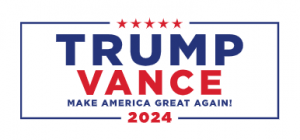
Let’s examine the logo for Donald Trump and his running mate, JD Vance:
We see that the names Trump and Vance are significantly larger than America, the country they promise to make great again (MAKE AMERICA GREAT AGAIN!). This suggests that their personal interests are prioritized above America’s interests.
The names and slogan are enclosed in a frame, emphasizing limitation. Trump and Vance face restrictions they may not be able to overcome.
The voters’ attention is divided between “Trump,” the largest word, and “Vance,” which, though smaller, is written in the powerful Yang color—red—drawing attention and energy to itself. Additionally, only certain elements are highlighted in red: 5 stars, Vance, and 2024. It almost suggests a split, with red and blue standing for different things: Trump and “Make America Great Again” are in blue, hinting that this may not be their year, or with Vance.
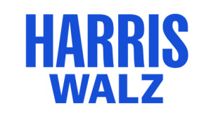
Kamala Harris and running mate Tim Walz’s logo is simpler yet more focused, highlighting only the two surnames. Harris is written with stronger Yang characters compared to the Walz name.
Notably, both names are in the same blue, indicating unity within the team—a shared ideology and goal.
There’s no extra design element to distract the viewer, so attention and energy naturally gravitate toward the main Yang element—Harris, which is both larger and positioned above Walz.
Additionally, Trump’s logo is more horizontal compared to Harris’s, which is slightly more vertical. As we know, horizontal layout tends toward Yin, while a vertical alignment suggests Yang. Yang energy is associated with winning in elections.
Considering all of the above, it’s possible to predict that Harris may win with a slight edge. Why a small margin? Because both logos are sufficiently strong, balanced, symmetrical, and effective.


